PPP3 modular evaluation
Through out
this project my design skills and technique have been both challenged and
broadened. The initial part of this brief was a research project to refine my
passion and skill set and find out what are of this large topic of interior
design my skills and interests lay in. Through researching other companies it
is clear to me that my interest lay in the office design sector and
specifically creative workspaces such as Google and Red Bull. The aspect that
interests me in this sector of design is, creating a workspace that will
inspire other projects in the future as we are so influenced both consciously
and sub consciously. The company I chose to follow and keep up to date with was
Jump Studios, the specialise in office, bar, hotel and club design, all aspects
that my SWOT analysis listed as having strengths in those areas of design.
From the
research we obtained through the first part, I was then to design a 8m cubed
space that applies to the sector of design you have highlighted being
interested in in the first part of the project. The location for the cube had
to conceptualise the function. I chose A&N media’s atrium area as my
location as it was a current on going project by Jump Studios and I have got in
touch with them prior to this part of the brief to ask what software they had
used to create their concept visuals as I was very impressed with how they
looked, another reason for choosing this location is I am hoping to send Jump
my work hoping for any feedback or just getting my work recognised would be
great.
The actual
design for my cube has changed through the brief as I challenged different
aspects of it such as the size and shape. Two design criteria that I wanted the
space to follow were to be both, a private, and social space so it is multi
functional and can transform when the function changes. I have ended up
achieving this though the use of hydraulic flooring that is movable, in doing
this I decided an animation was the best way to show the client how this would
happen, which meant I had to push my skills and learn some new software skills
to create a short animation but ended up enjoying doing it rather a lot.
I have used
Google sketch-up to create a 3D digital model and it is from this that I have
taken my main visuals and adapted in Photoshop. I have taken my feedback from previous
projects in to consideration when designing my concept boards, I have tried to
make them less conceptual and more realistic. Overall I am very happy with all
aspect of this project and have learned lots of new skills from, publishing my
own blog to making an animation.
Final Visual A3 Boards


Final Interior Visuals


Conceptual Visual Development


Lighting Ideas
Use of coloured block lighting could be used as additional movable furniture seating for the cube. Use of my brand colours could be used to fit with my brand image.


These LED strip lights create a atmospheric glow that is beneficial for work levels and concentration. A good location for these lights would be in the print rollers that create the roof structure.

LED also provides excellent light quality and outstanding control, letting you change colours, moods and ambience at the flick of a switch. By helping you create inspiring and welcoming environments, and inspired and productive employees, LED stimulates more than just positive comments.
http://www.lighting.philips.co.uk/application_areas/office/leds_in_offices/


How can colours change your moods article
“We react on multiple levels of association with colours there are social or culture levels as well as personal relationships with particular colours,”
Hydrolics- Moving Floors
Rem KoolhasInnovations and evolutions of architectural elements can contribute to the creation of spaces with overlapping programs. Rem Koolhaas’ design for a house in Bordeaux, France, incorporates a hybrid vertical circulation/floor system. The movable floor, originally designed to accommodate a handicapped client.

The house in Bordeaux further investigates the possibilities of the vertical circulation system, creating spaces that shift between solid and void, open and closed, and providing sectional flexibility to suit the programs below or above.

 Millionaires movable car garage
Here is another example to the function of a movable floor, maybe not quite as practical but still means the technology is there for a project such as mine.

 The piece is the physical embodiment of Plensa´s notion that we are surrounded by an invisible cloud of poetry, and the idea that words hang in the air having been spoken. The cut steel letters are selected from some of the most important poems and texts to have influenced the artist. Twenty-Nine Palms invite the presence of people and as we walk through it, it produces sound as the metal elements collide. Plensa makes text physical, lifting and freeing it from the page and transforming it from two to three dimensions so that we can see the letters from all angles. We become engaged with and immerse in the poetry around us, experiencing it with our body rather than the more accustomed, abstract level of reading.


These ideas for folding chairs ann't the conventional folding chair design, these designs have taken a contemporary take on metal folding chairs that are often heavy and hard to construct. A wooden finish on the chairs would give a more executive feel to the space and are extremely thin when store away and also easily stacked.


This smart chair folding system, would mean when the chairs aren't being used they can be used as dividers to break the space up and also could evan be used as a message board to display use full information about the function the space holds when its in its social playful mode.

I am going to look at the possibility of storage in the floor space?
 This would create a more open plan space for when the cube is in its social function but would also limit the amount of table top space the users would have to prepare the block printing on.
 With smart use of modular seating it is possible that different seating arrangements can be formed depending on the needed function at the time. Due to having such a small space the interior furnishing will have to follow a similar shape to that of the exterior frame.


Another functional piece of furniture that will be important in the space is a jacket rail. As there is a playful element to the function of the space.


I have been researching the possibilities of printing on to a translucent material such as glass or smart glass. This would mean the users can have a function that can relate to the business model, which is printing.
If it was possible for the theremo cromic ink to be laid over the smart glass this would mean that block printing with hand carved wooden blocks on to glass would be possible.
 This would mean the exterior appearance of the space would be visibly different and the employees in the rest of the atrium will know what function the space holds at that time. Whether its appearance be frosted glass or there be prints on the windows.

 This interactive instillation in Miami International Airport is a sound and light instillation that uses the suns light during the day to create this stain glass pattern on the walkway of the hall way. There is also sounds that change as you walk through the space that relate to the colour you are walking through. For example in the reds and oranges I can imagine a warmer sound such as the sound of the waves crashing against the beach and getting colder as you get to the blue colours this could be the sound of someone walking through snow.

This instillation is transformed at night with interior lighting illuminating the glass creates a aesthetically pleasing visual affect on the exterior rather than interior visual that is created during the day by natural light.

 This piece of architecture changes from day time to night time, it achieves this by using the heat of the sun to react with the paint creating this turquoise green colour that changes depending on the amount of hear applied to the exterior.


 One of the designers constraints was that the cabin had to fit in between the structural poles holding the above canopy up. In doing this they have created another type of invisible structure as it has been built in to its surroundings.

 This section is a good image for me to visualise how the possibilities of suspending the structure and how many points of contact and cables would be needed.

 This is just a simple idea of how a separate exterior structure can take the weight of a small space. Use of iron girders isn't very attractive but is a simple option
These private meeting rooms have been designed and constructed in the stairway structure so the their isn't any visible structure that isn't functional as the stairs are a functional part of the interior.
 I have notice good use of the roof of the structure is possible creating a second level. This is one benefit of choosing a large space such as a atrium as the location for a project similar to this one.


“We imagine our project on different scales to explore possibilities of movement and flexibility in architecture and design redefining processes and the standard components of design grammar.”
 Proper insulation could go a long way in saving energy, but that isn’t easy to achieve, especially for large structures and buildings. The Media-TIC building designed by Cloud 9 architects could have a facade that would work well as insulation and save the building a lot of energy. Architect Enric Ruiz-Geli has designed an inflatable membrane facade for the building, which would help reduce energy consumption and lower its carbon emissions by as much as 37 percent.
"Many firms enjoy all of the benefits of smart glass in their situation room board room, or conference room. This is popular in government and corporate settings. Especially when integrated into a full automation system." http://pharosglass.com/main/?page_id=136
 Dutch company Peer+ has unveiled the latest in BIPV technology in the form of Smart Energy Glass for windows that generate renewable energy and give you the desired privacy as well. Similar to the upcoming LCD glass treatments, these windows let you change their transparency level at the flick of a switch and feature a “Privacy Mode” where the glass is at its darkest.

 Today, printing is very different from the process used in Gutenberg's workshop. By modern standards, Gutenberg's printing process may seem slow and tedious; compositors put type together by hand, and a skilled compositor could assemble 2,000 characters or letters in an hour. A computer can arrange the same number of characters in about two seconds. Today, more words are being printed every second than were printed every year during the fifteenth and sixteenth centuries.
 In the late eighteenth century and early nineteenth century, inventors began modifying the printing press by making parts of the press out of metal instead of wood. Earl Stanhope of England created a printing press with a cast-iron frame. In 1800, he invented the Stanhope Press, which was the first book press made completely out of cast-iron. The press also featured a combination of levers to give the pressman added power. It created powerful, cleaner impressions, which were ideal for printing woodcuts and larger formats.


 In 1844, Richard Hoe invented the rotary press. A rotary press prints on paper when it passes between two cylinders; one cylinder supports the paper, and the other cylinder contains the print plates or mounted type. The first rotary press could print up to 8,000 copies per hour. Larger rotary presses, containing multiple machines, made printing large newspaper runs possible.


 Use of wire/cables to hang the cube, Interesting weave or spiral structure attached to large atrium ceiling, possible use of letter press letters in the "invisible structure" this will add visual meaning to the structure and add to the creative flair of the space.
 Different size texture and material used for different letters and fonts.
 In creating these simple models using paper I have been able to visualise how light will pass through the space. Also i am trying to move away from the solid cube structure as i want to create an "invisible structure" much like one of Shigeru Ban's paper structures. I mean "invisible" in that the user doesnt look at the exterior and think of it as the structure but something that is aesthetically pleasing and also functional.

As I have used paper to create these models once the structure becomes more intricate the model struggles to hold its weight.
So for the next series of models I have draw a net on Adobe Illustrator and added some geometric patterns and used the laser cutter to cut them out on to card, in doing this the model will be more durable.

I now need to think how I can include visual meaning that will inspire the printers. I need to think what will motivate them to be creative.
 I am going to look in to the printing press and its development through time to see how the large machine has changed through time and what this has done to the newspaper printing company.


 "One of the most important underlying themes in Ban's work [is] invisible structure. He avoids overt expressions of structure, or 'structure-for-structure's sake,' and instead adheres to a construction method in which structure is integrated into the overall design."—Matilda McQuaid, Author of Shigeru Ban

For Ban, one of the most important themes in his work is the “invisible structure”. That is, Ban doesn’t overtly express his structural elements, but rather chooses to incorporate it into the design. Ban is not interested in the ‘newest’ materials and techniques, but rather the expression of the concept behind his building. The materials he chooses to use are deliberately chosen for how they aid the building to do so.

Ban is most-famous now for his innovative work with paper and cardboard tubing as a material for building construction. Cardboard is a lay term used to describe a variety of heavy wood-based types of paper notable for their stiffness and durability. Cardboard furniture is furniture designed to be made from cardboard or heavy wood-based types of paper. It is thin material produced by the amalgamation of plant fibres, which are subsequently held together without extra binder, largely by hydrogen bonds and to a large degree by fibre entanglement. The fibres used are usually natural and composed of cellulose. The most common source of these kinds of fibres is wood pulp from pulpwood trees, largely softwoods such as spruce.
Ban fits well into the category of “Ecological Architects” but he also can make solid claims for being modernist, a Japanese experimentalist as well as a rationalist. “I don’t like waste” is an apt quote from Ban, summing up his philosophy, known as “Paper Architecture.”


Architecture the James Turrell way states: “The qualities of the space must be seen, and the architecture of the form must not be dominant.” That’s the approach one firm is taking with the Tower Infinity in South Korea. It’s being marketed as the first “invisible skyscraper.” The building will be wrapped in a “reflective skin” that reveals the surrounding environment. Camouflaged buildings are nothing new, but architects and designers are still learning how to refine and conceptualise these structures to help people experience form and space in unique ways.
This transparency lends a beautiful and often fragile quality to buildings, but it can also be a poignant statement about man’s intrusion upon the environment. Maybe with the use of smart glass the privacy issue could be solved as this is vital if i'm wanting to create a multifunctional space.

This building has inspired the form I could see my exterior taking at this point. This is also a eco building as the glass used, absorbs UV rays from the sun and converts them in to energy such as electricity.

 Also still thinking about how I am going to create the "invisible structure" this image I have found started my thinking about how I could suspend the cube in the large atrium I have chosen as my location. This image is actually a logo for a 3D software modelling software programme but I imagined this upside down creating a interesting roofing structure the could take the weight of the cube.


 Visualising the cube will be a important part of my project, use of different materials can change your expectations of what you think the function of the space is. The use of metals and woods would make me think of an older end user where as soft materials such as cotton or wool would make me think the end user would be younger or more creative. The use of vibrant colour would make me think of childish and playful functions.


 This model has made me start to think about how important the structure to the exterior of the cubic space will be. An interesting structure will draw the users in as the will question the space making them intrigued instantly. This has also made me consider how light will affect the final outcome and also the shadows it creates on the location also have to be considered

This cubic form has been constructed from 1000s of different sized cubes. This has given the exterior a rough, rugged edge also as the cubes aren't laid on the exterior on the same angle the light reflects different surfaces in different ways, this is how so many shades of white, grey and black have been created, evan though all of the blocks are the same colour. I imagine the interior of the space to be very dark but rough jagged edges creating textured walls for the user to feel his or her way around.

This cube has a more ordered system regarding the construction. Each level has been created using the same amount and same sized blocks. There is a very symmetrical object and symmetry is often used in minimal cubic architecture. If this was an interior space it would have seven horizontal planes of light cutting through the space where each level is placed on top of the other.
 This interesting structure has been constructed using different sized interlocking cubic frames. The base of the structure consists of two hundred and fifty six cubic frames and the next level only sixteen, the four and then one creating this pyramid like structure.


If different panels of the cube were constructed from different materials how would it change how light passes through it. So the use of glass would mean those areas are well lit and can be looked in to from the exterior.

How would the use of colour change the affect?

How an interior space could be broken up through the use of the cubes?
With the use of floating cubes, this maze like interior has been developed that you would have to duck and weave through to manoeuvre through the space.


How would the use of colour add to this interior?
Triangles and circles also fell in to my research, to see if there is any crossovers when deconstructing the shapes, so are they made up of similar components?

The triangle can be broken down in to lines, rectangles and a triangle in the middle meaning it shares similarities where as the circle can only be broken in to curved lines so doesn't share any of the same characteristics.


Designed by the Stockholm-based firm Tham & Videgård Arkitekter, the Mirrorcube features reflective external surfaces making the cube almost camouflaged in to its surroundings. The interior of the Mirrorcube is only 16 sq. m (172 sq. ft.), though that’s enough for a kitchenette, queen bed, small bathroom and sitting area.

 One of the rooms, this giant “bird nest,” is supported by the tree in which it is perched and covered in twigs. Reached via an retractable staircase, the interior does not look nearly as rustic as the outside.

use of cardboard, paper or wood to create small ideas getting you thinking how the cube could change form .

The similarities between the initial experimentation with the blocks can be seen here. Small models make visualising the space and its scale much simpler also can help you as a designer see how light will pass through the space.


 With the population ever increasing and space in large built environments becoming ever hard to find, but people are wanting to live there to be close to the office or transport lines, this has meant this new era of compact living and multi functionality has become ever more relevant and its seen in many aspects of design.
In recent years 'pod hotels' have started to be developed more and more. Starting off in airports to be used for business men who have long stop overs in airports but more recently this idea has been developed further moving in to city centres where we are becoming more and more limited with the amount of free space we have

This smart seating arrangement has been designed to suit many needs. Twenty different arrangements can be created depending on the functionality the user wants from the space. It can be made in to a small eating area for children to storage area and play space.


Another example of a modular seating system that applies to an older generation, each individual slab of wood can be reversed 90 degrees, turning the seat upside down creating a flat working space, another benefit some people may find with this bench is you could make it so no one could sit straight next to you.
Through out this project I have had to research successful interior design companies to help me choose the sector of design I would most like to pursue as a career opportunity. I have always been interested in designing creative spaces for creative business models, the idea of creating an inspiring place for so many people and their work really pushes me to produce something unique that will inspire many projects in the future as we are so influenced by our surroundings, weather it be the mood the space puts you in, the way you work within the space or the type of design you create your surroundings will influence this subliminally and this idea of inspiring many projects in the future has lead me to want to focus my strengths and also aspects I need to improve towards Office design but especially for creative business’.


Jump were commissioned by Bloomberg to create an installation at their Finsbury Square headquarters, as part of their on going arts program. The space was over three consecutive floors and the brief was open, with the only stipulation that the design must be useful and accessible to staff. To keep with the playful ethos of the Bloomberg they proposed a tree instillation to break up the large space, broken down into three parts, that appears to rise through the floors, forming meeting and social opportunities at each level.
The trunk acts as a private nook or enclosure, the branches form a thicket with integral benches, and the canopy is made up of more informal soft-foam parts for lounging. The idea was born out of a desire to temper Bloomberg's massively technological and frenetic environment of TV screens, monitors and audio broadcasts.
Apart from conveying the right message visually, the tree has a functional purpose too, slowing activity down, section-by-section, and providing a series of spaces and furniture elements for people to meet around, escape into, or just chill out on.

 The offices occupy three floors, including a recent roof-level extension. To ensure movement of people through the building, a series of voids had to be cut into the floor plate and dropped a slide and a floating staircase through the middle, offering either visual or physical connectivity throughout.
The benefit is an open, efficient, dynamic and connected workspace. This energised and kinetic experience brings the Red Bull brand to life, supported by a formal and material palette inspired by the movement and technologies inherent in the adrenaline sports at the heart of the company’s business.
Working alongside carpentry and engineering specialist Nicholas Alexander on the construction of the interior, which had to meet stringent marine specifications on matters such as ventilation and fire safety, while also satisfying the operational requirements of the submarine.

The vertical and horizontal planes, entrance/exit design of the cube is up to you.
Resources: Masking tape, lining paper rolls, roll of tracing paper, electric tape and a ball of string.


 Brinkworth - Bulo
Bulo is a product design company, looking through their product range it seems when designing a product the strip it down to its bare minimum and create a simple yet stylish product. The interior of their office very much portrays some of these signs with exposing the brick work and industrial piping of the ceiling of the office.

One of the issues Brinkworth architects encountered with this space was the lack of natural light, a cleaver use of lighting through out the space creates the effect of natural light and windows where there aren't any.


Here is another example to the function of a movable floor, maybe not quite as practical but still means the technology is there for a project such as mine.

Jaume Plensa


 Furniture


 Furniture
As this is a multi functional space the furniture needs to be easily stored away when not being used or adapted to the amount of people either fold away furniture is key to the functionality of the space or use of modular furniture in the space could also benefit the design.

These ideas for folding chairs ann't the conventional folding chair design, these designs have taken a contemporary take on metal folding chairs that are often heavy and hard to construct. A wooden finish on the chairs would give a more executive feel to the space and are extremely thin when store away and also easily stacked.


This smart chair folding system, would mean when the chairs aren't being used they can be used as dividers to break the space up and also could evan be used as a message board to display use full information about the function the space holds when its in its social playful mode.

I am going to look at the possibility of storage in the floor space?
 This would create a more open plan space for when the cube is in its social function but would also limit the amount of table top space the users would have to prepare the block printing on.
Modular Seating


Another functional piece of furniture that will be important in the space is a jacket rail. As there is a playful element to the function of the space.


Use of the draws from the storage compartments used to house the metal letters could be designed in to a glass table topped table with storage included. This would create a multifunctional piece of furniture that could be used for both functions of the space.
While the space is in private meeting mode it means the users can have a simple yet meaning full workspace and when the space is in its its playful, social mode the table can be used as storage for printing apparatus the users will be using to get creative and motivated.
I have been researching the possibilities of printing on to a translucent material such as glass or smart glass. This would mean the users can have a function that can relate to the business model, which is printing.
If it was possible for the theremo cromic ink to be laid over the smart glass this would mean that block printing with hand carved wooden blocks on to glass would be possible.
 This would mean the exterior appearance of the space would be visibly different and the employees in the rest of the atrium will know what function the space holds at that time. Whether its appearance be frosted glass or there be prints on the windows.
 How to achieve visual colour change?

When the function of my space change changes, it is also important that the appearance changes so the end users know what function the cube holds.
Use of thermocromic ink would mean that once heat is applied the exterior colour or appearance can change.

In this case these windmills have been painted so that when they are producing energy they change colour creating a more colourful, inspiring structure.
These big, colourful generators change attitudes, for they will generate not only power but an ‘emotional mantle’ and an enormously positive acceptance in those who live or work near them.
Harmonic Runway


This instillation is transformed at night with interior lighting illuminating the glass creates a aesthetically pleasing visual affect on the exterior rather than interior visual that is created during the day by natural light.

Thermocromic Dome


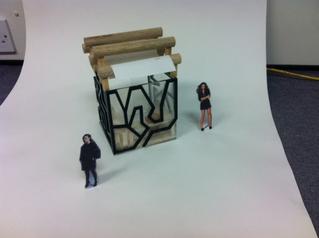
How to suspend the cube?

Suspended writers cabin
This is an interesting projects that I can take inspiration from. The canopy structure that lays above the cabin was already there prior to this design.
 One of the designers constraints was that the cabin had to fit in between the structural poles holding the above canopy up. In doing this they have created another type of invisible structure as it has been built in to its surroundings.
Also the interior to this space has a functional purpose, the exterior frame has a book case constructed in to the shape, giving the walls a function which is important in a small space such as this.


Still with the concept of "invisible structure" I am thinking how to make the cube structurally safe if its going to be suspended in the lobby area. I will have to use another structure of some kind attached to the floor or ceiling, I want the structure to add visual meaning to the end users, them being printers I am wanting to incorporate letters from the original letter press, as its the foundations of Associated Newspapers the company I have chosen to create the space for.
 This is just a simple idea of how a separate exterior structure can take the weight of a small space. Use of iron girders isn't very attractive but is a simple option
 These private meeting rooms have been designed and constructed in the stairway structure so the their isn't any visible structure that isn't functional as the stairs are a functional part of the interior.
 I have notice good use of the roof of the structure is possible creating a second level. This is one benefit of choosing a large space such as a atrium as the location for a project similar to this one.

Wood material that flexes like skin video link

“We imagine our project on different scales to explore possibilities of movement and flexibility in architecture and design redefining processes and the standard components of design grammar.”

Smart Glass
"Many firms enjoy all of the benefits of smart glass in their situation room board room, or conference room. This is popular in government and corporate settings. Especially when integrated into a full automation system." http://pharosglass.com/main/?page_id=136

Pharos Smart Switchable Glass Configuration:
· Maximum Size: 1,200 X 3,000 mm
· Minimum Size : 200 X 300 mm
· Weight : approximately 30Kg/m²
· Thickness : Various from 8.8 mm for single laminated and from 20mm double glazed units
· Electrical characteristic : Operating Voltage ( > 50 VAC<110 VAC ) , Frequency Range ( 50~60HZ) , Amperage ( 100 mA per Square meter for 100V ), Power Consumption (7W per Square meter for 110V )
· Switching Speed : Less than 1 Second
· From Frosted to Clear : 100 Milliseconds
· From Clear to Frosted : 400 Milliseconds
· Visible Angle : 130˚
· Glass Type : Standard annealing , Reflective , Low-E Glass and Tended Glass
· Warranty : 4 Years

Advantages And Benefits of using pharos smart switchable glass:
· Instant and precise privacy control
· Efficient use of space in the built environment
· Blocks 99.5+% of damaging UV rays
· Eco friendly
· Exceptional optical qualities that reduce glare and eye strain
· High durability, solid state technology with no moving parts to wear out or break
· Large sizes of many shapes can be produced
· Stable colour characteristics for the life of the unit
· Aesthetically pleasing, hygienic & low maintenance
· Reduce uncomfortable “ Gold Fish Bowl “ feeling when working in high density office buildings
· High UV stability
· Low working Voltage
· High Contrast for use as rear projection screen
· Long life – tasted to in excess of 1,000,000 Cycles


Smart windows provide privacy and generate renewable energy
Smart Glass Video
 Dutch company Peer+ has unveiled the latest in BIPV technology in the form of Smart Energy Glass for windows that generate renewable energy and give you the desired privacy as well. Similar to the upcoming LCD glass treatments, these windows let you change their transparency level at the flick of a switch and feature a “Privacy Mode” where the glass is at its darkest.
Developement of The Printing Press
How has printing changed since Gutenberg's invention?
 Today, printing is very different from the process used in Gutenberg's workshop. By modern standards, Gutenberg's printing process may seem slow and tedious; compositors put type together by hand, and a skilled compositor could assemble 2,000 characters or letters in an hour. A computer can arrange the same number of characters in about two seconds. Today, more words are being printed every second than were printed every year during the fifteenth and sixteenth centuries.
What changed? Why aren't we still using Gutenberg's press? Until the nineteenth century, printers completed each step of printing by hand, just as they did in Gutenberg's printshop. As technology evolved, inventors adapted these new technologies to revolutionize printing. Steam engines and, later, electrical engines were incorporated into the design of printing presses. In the 1970s, computers were integrated into the printing process.
The Printing Press Gets Recast in Cast Iron
In the late eighteenth century and early nineteenth century, inventors began modifying the printing press by making parts of the press out of metal instead of wood. Earl Stanhope of England created a printing press with a cast-iron frame. In 1800, he invented the Stanhope Press, which was the first book press made completely out of cast-iron. The press also featured a combination of levers to give the pressman added power. It created powerful, cleaner impressions, which were ideal for printing woodcuts and larger formats.
The Columbian Press, invented in 1816 by George Clymer of Philadelphia, was also an iron hand press. It could print 250 copies per hour. The press was noteworthy because it used a series of weights and counterweights, making it relatively easy for the printer to increase the force of the impression and raise the platen after each impression. The eagle mounted on the top of the press served as both a patriotic symbol and a counterweight.
Like Gutenberg's press, these platen presses had a flat surface bearing the paper, which was pressed against the flat-inked plate.
Mechanised Presses In 1824, Daniel Treadwell of Boston first attempted to mechanize printing. By adding gears and power to a wooden-framed platen press, the bed-and-platen press was four times faster than a handpress. This type of press was used throughout the nineteenth century and produced high-quality prints. In 1824, Daniel Treadwell of Boston first attempted to mechanize printing. By adding gears and power to a wooden-framed platen press, the bed-and-platen press was four times faster than a handpress. This type of press was used throughout the nineteenth century and produced high-quality prints.
In 1812, Friedrik Koenig invented the steam-driven printing process and dramatically sped up printing. The Koenig Press could print 400 sheets per hour. Richard Hoe, an American press maker made improvements to Koenig's design, and in 1832 produced the Single Small Cylinder Press. In a cylinder press, a piece of paper is pressed between a flat surface and a cylinder in which a curved plate or type is attached. The cylinder then rolls over the piece of surface and produces an impression over the paper. Cylinder presses were much faster than platen and hand presses and could print between 1,000 and 4,000 impressions per hour.
|

Rotary Press
 In 1844, Richard Hoe invented the rotary press. A rotary press prints on paper when it passes between two cylinders; one cylinder supports the paper, and the other cylinder contains the print plates or mounted type. The first rotary press could print up to 8,000 copies per hour. Larger rotary presses, containing multiple machines, made printing large newspaper runs possible.
Paper: On A Roll In 1865, William Bullock invented the Bullock Press, which was the first press to be fed by continuous roll paper. The use of roll paper is important because it made it much easier for machines to be self-feeding instead of fed by hand. Once threaded into the machine, the paper was then printed simultaneously on both sides by two cylinder forms and cut by a serrated knife. The press could print up to 12,000 pages per hour, and later models could produce 30,000 pages per hour. The first roll papers were over five miles in length. Today, roll paper is still used in many presses. In 1865, William Bullock invented the Bullock Press, which was the first press to be fed by continuous roll paper. The use of roll paper is important because it made it much easier for machines to be self-feeding instead of fed by hand. Once threaded into the machine, the paper was then printed simultaneously on both sides by two cylinder forms and cut by a serrated knife. The press could print up to 12,000 pages per hour, and later models could produce 30,000 pages per hour. The first roll papers were over five miles in length. Today, roll paper is still used in many presses. |
Mechanical Composition
Until the late nineteenth and early twentieth centuries, all type was set and composed by hand, as in Gutenberg's workshop. Monotype and Linotype machines changed the printing process because they used mechanical means of setting type, which was much more efficient than hand composition.
In a Linotype machine, an operator would type on a keyboard similar to a typewriter, which produced a perforated band of paper. The band was then decoded by a machine that cast type from hot metal. These machines cast a whole row of type at a time, so if an operator made an error it meant the whole line would have to be retyped and recast.
Invented in 1889, the Monotype machine worked much like the Linotype machine. A monotype operator would similarly type out a text. Each key stroke produced a perforated tape. The operator then tore off the tape and ran it through a separate casting machine, which produced a mould containing matrices for each character. Monotype had the advantage of being easier to correct because it was possible to remove a single letter of type, rather than having to recast a whole row of type. Monotype also produced a finer quality type, so it was frequently used in the book trade, while linotype was often used at newspaper presses because of its speed and economy.
http://www.hrc.utexas.edu/educator/modules/gutenberg/books/printing/

Letters used on the printing press could be used within the structure to remind the printer about the heritage of their occupation.
How to create invisible structure that will suspend the cube space?
 Use of wire/cables to hang the cube, Interesting weave or spiral structure attached to large atrium ceiling, possible use of letter press letters in the "invisible structure" this will add visual meaning to the structure and add to the creative flair of the space.
Initial 3d models


As I have used paper to create these models once the structure becomes more intricate the model struggles to hold its weight.
So for the next series of models I have draw a net on Adobe Illustrator and added some geometric patterns and used the laser cutter to cut them out on to card, in doing this the model will be more durable.

I now need to think how I can include visual meaning that will inspire the printers. I need to think what will motivate them to be creative.
 I am going to look in to the printing press and its development through time to see how the large machine has changed through time and what this has done to the newspaper printing company.
Shigeru Ban
Invisible Structure
 "One of the most important underlying themes in Ban's work [is] invisible structure. He avoids overt expressions of structure, or 'structure-for-structure's sake,' and instead adheres to a construction method in which structure is integrated into the overall design."—Matilda McQuaid, Author of Shigeru Ban
For Ban, one of the most important themes in his work is the “invisible structure”. That is, Ban doesn’t overtly express his structural elements, but rather chooses to incorporate it into the design. Ban is not interested in the ‘newest’ materials and techniques, but rather the expression of the concept behind his building. The materials he chooses to use are deliberately chosen for how they aid the building to do so.

Ban is most-famous now for his innovative work with paper and cardboard tubing as a material for building construction. Cardboard is a lay term used to describe a variety of heavy wood-based types of paper notable for their stiffness and durability. Cardboard furniture is furniture designed to be made from cardboard or heavy wood-based types of paper. It is thin material produced by the amalgamation of plant fibres, which are subsequently held together without extra binder, largely by hydrogen bonds and to a large degree by fibre entanglement. The fibres used are usually natural and composed of cellulose. The most common source of these kinds of fibres is wood pulp from pulpwood trees, largely softwoods such as spruce.
Ban fits well into the category of “Ecological Architects” but he also can make solid claims for being modernist, a Japanese experimentalist as well as a rationalist. “I don’t like waste” is an apt quote from Ban, summing up his philosophy, known as “Paper Architecture.”


Architecture the James Turrell way states: “The qualities of the space must be seen, and the architecture of the form must not be dominant.” That’s the approach one firm is taking with the Tower Infinity in South Korea. It’s being marketed as the first “invisible skyscraper.” The building will be wrapped in a “reflective skin” that reveals the surrounding environment. Camouflaged buildings are nothing new, but architects and designers are still learning how to refine and conceptualise these structures to help people experience form and space in unique ways.
This transparency lends a beautiful and often fragile quality to buildings, but it can also be a poignant statement about man’s intrusion upon the environment. Maybe with the use of smart glass the privacy issue could be solved as this is vital if i'm wanting to create a multifunctional space.

This building has inspired the form I could see my exterior taking at this point. This is also a eco building as the glass used, absorbs UV rays from the sun and converts them in to energy such as electricity.

Function
This structure has made me think the exterior facade crates different shaped frames and would it be possible for the users to print on to the windows with washable ink when the cube is in its social area function, this would mean it would be seen on the exterior, changing its visual appearance when the function changes is vital. I now need to think how to change the appearence when the function of the cube is for a private meeting space and the printing activity equipment to be stored away.


How can I make it inspirational for a printer?
The wire or chain used to suspend the cube could be formed or surrounded by old letters from the original letter press, this will instantly make the user relate to the history of the company and the function of the cube.

Cubic Models
 Visualising the cube will be a important part of my project, use of different materials can change your expectations of what you think the function of the space is. The use of metals and woods would make me think of an older end user where as soft materials such as cotton or wool would make me think the end user would be younger or more creative. The use of vibrant colour would make me think of childish and playful functions.
This grid like structure looks to have been influenced by this years Serpentine pavilion that resembles the interior framework of what i could imagine a computer game to be constructed from. Also the shadow's these structures create is interesting.


This cubic form has been constructed from 1000s of different sized cubes. This has given the exterior a rough, rugged edge also as the cubes aren't laid on the exterior on the same angle the light reflects different surfaces in different ways, this is how so many shades of white, grey and black have been created, evan though all of the blocks are the same colour. I imagine the interior of the space to be very dark but rough jagged edges creating textured walls for the user to feel his or her way around.

This cube has a more ordered system regarding the construction. Each level has been created using the same amount and same sized blocks. There is a very symmetrical object and symmetry is often used in minimal cubic architecture. If this was an interior space it would have seven horizontal planes of light cutting through the space where each level is placed on top of the other.


If different panels of the cube were constructed from different materials how would it change how light passes through it. So the use of glass would mean those areas are well lit and can be looked in to from the exterior.

How would the use of colour change the affect?

How an interior space could be broken up through the use of the cubes?
With the use of floating cubes, this maze like interior has been developed that you would have to duck and weave through to manoeuvre through the space.


How would the use of colour add to this interior?
This idea using metals has lead me to think how could the use of mirrors make such a small space feel more open.
Breaking up any shape and mirroring the outcome would be seen like these examples. The benefit of breaking your shape up is, you can see what the shape is built up from.
The exterior of a space often influences the interior as they are relative to each other, as my exterior space of my project is cubic I decided researching the symmetry and what a cube is made up of is important to understanding what I can achieve from this space.
 Symmetry

Triangles and circles also fell in to my research, to see if there is any crossovers when deconstructing the shapes, so are they made up of similar components?

The triangle can be broken down in to lines, rectangles and a triangle in the middle meaning it shares similarities where as the circle can only be broken in to curved lines so doesn't share any of the same characteristics.


From a solid cube, he created an interior space maintaining the perimeter and outside geometry of the cube.
He structured this interior throw triangles which can change their dimensions and angles. The control of this triangles is what makes the cube be able adapt to new shapes and in turn, have the ability to be joined together like a lego.
Swedish Tree House Hotel

MirrorCube

Designed by the Stockholm-based firm Tham & Videgård Arkitekter, the Mirrorcube features reflective external surfaces making the cube almost camouflaged in to its surroundings. The interior of the Mirrorcube is only 16 sq. m (172 sq. ft.), though that’s enough for a kitchenette, queen bed, small bathroom and sitting area.

Birds Nest
One of the rooms, this giant “bird nest,” is supported by the tree in which it is perched and covered in twigs. Reached via an retractable staircase, the interior does not look nearly as rustic as the outside.How can concept ideas portray in to final design?
use of cardboard, paper or wood to create small ideas getting you thinking how the cube could change form .

The similarities between the initial experimentation with the blocks can be seen here. Small models make visualising the space and its scale much simpler also can help you as a designer see how light will pass through the space.

How can a cube be constructed from geometric shapes?
A solid cubic exterior form could be a rather boring exterior style and wouldn't draw people to it. By breaking the shape up in to more interesting forms a structure more like this concept idea that reminds me of a sort of honeycomb like structure.
Residential compact living


Pod Hotels
In recent years 'pod hotels' have started to be developed more and more. Starting off in airports to be used for business men who have long stop overs in airports but more recently this idea has been developed further moving in to city centres where we are becoming more and more limited with the amount of free space we have
Multifunctionality
Definition of Multifunctional Spaces
The word ‘multifunctional’ is an adjective and its lexical meaning is: having or fulfilling several functions . A multifunctional space performs at least two functions. According to Longman dictionary a multifunction space is designed to have several different uses. Multifunctional space is the opposite of single-purpose space which is designated for a specific function. In the literature of architecture, a space that accommodates several activities is a multifunctional space . According to this definition,
courtyards and kitchens are multifunctional spaces. Also, multifunctional spaces can be transition spaces. But from another view, they are the spaces which are used for exhibitions, lectures, and special events.
 Development of smart structures can be traced back to aerospace’ technologies for seeking incorporate sensing and actuation capabilities into space-durable membrane structures. According to the mentioned definition, the smart structures are flexible and able to react. But what is focused by this paper is the scale of this reaction. Nanoscale reactions are based on smart materials and real-scale reactions are based on mechanical flexibility and mechanical equipments.
http://www.ijapm.org/papers/043-P0044.pdf
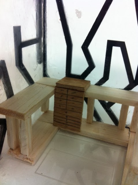
Modular Furnishings

This smart seating arrangement has been designed to suit many needs. Twenty different arrangements can be created depending on the functionality the user wants from the space. It can be made in to a small eating area for children to storage area and play space.
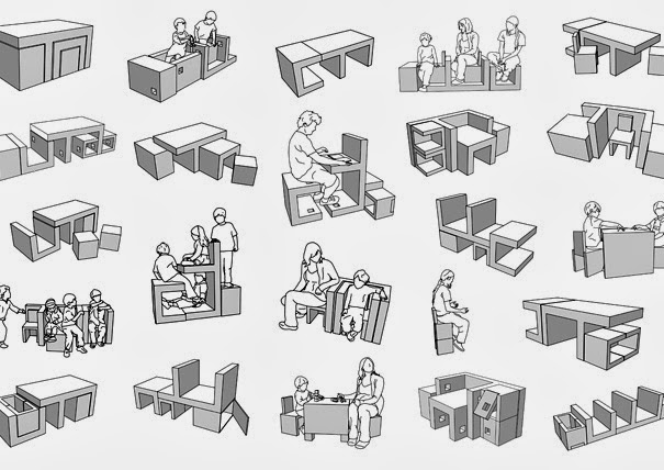

Another example of a modular seating system that applies to an older generation, each individual slab of wood can be reversed 90 degrees, turning the seat upside down creating a flat working space, another benefit some people may find with this bench is you could make it so no one could sit straight next to you.
Part 2 PPP3 Brief: Declaring space
Through part one of this brief i was asked to research successful interior design/architecture companies to help me decide which sector of design most interests me as interiors is such a large area. I also had to look at the sort of credentials they expected from employees and compare them to my own by updating my SWOT analysis and creating a personal development plan for myself. A SWOT analysis helps you realise your own strengths and weaknesses but also your threats and opportunities later in life and from this you create your PDP this helps you focus more on developing a pathway for my future career.Through out this project I have had to research successful interior design companies to help me choose the sector of design I would most like to pursue as a career opportunity. I have always been interested in designing creative spaces for creative business models, the idea of creating an inspiring place for so many people and their work really pushes me to produce something unique that will inspire many projects in the future as we are so influenced by our surroundings, weather it be the mood the space puts you in, the way you work within the space or the type of design you create your surroundings will influence this subliminally and this idea of inspiring many projects in the future has lead me to want to focus my strengths and also aspects I need to improve towards Office design but especially for creative business’.
Jump Studios Research
A&N Media

The company occupies a large part of the former Barkers department store which was converted into an office building in the late 1980's. Jump studios have been asked to re-develope the site and to create a social meeting area out of the old atrium. This large five story space has a lot of potential and by the looks of these concept designs Jump studios are making the most out of the large open space. One key value of their designs for this project is the fact they include some aspect of the company's ethos and history when selecting materials such as tweed finishes and english oak furnishings. Also they have connected they walkways/routes through the building opening the space up more with a better flow of people through the space.


This sectional view of the design is a great visual to see how large this space is and also the different planes it has been designed over creating different levels and areas for people to meet and exchange ideas.
Bloomberg


Jump were commissioned by Bloomberg to create an installation at their Finsbury Square headquarters, as part of their on going arts program. The space was over three consecutive floors and the brief was open, with the only stipulation that the design must be useful and accessible to staff. To keep with the playful ethos of the Bloomberg they proposed a tree instillation to break up the large space, broken down into three parts, that appears to rise through the floors, forming meeting and social opportunities at each level.
The trunk acts as a private nook or enclosure, the branches form a thicket with integral benches, and the canopy is made up of more informal soft-foam parts for lounging. The idea was born out of a desire to temper Bloomberg's massively technological and frenetic environment of TV screens, monitors and audio broadcasts.
Apart from conveying the right message visually, the tree has a functional purpose too, slowing activity down, section-by-section, and providing a series of spaces and furniture elements for people to meet around, escape into, or just chill out on.

Red Bull
Jump's challenge was to amalgamate two separate offices into one central London headquarter building, and design the space in such a way as to encourage interaction between employees whilst encapsulating the values of the brand.
Red Bull prides itself on the vast array of adrenalin sports it is actively involved in, underpinned by its stated aim to ‘stimulate body and mind’. The central design idea evolved from this – an environment that would stimulate employees and visitors alike, and that would manifest the adrenaline and excitement associated with the brand.
 The offices occupy three floors, including a recent roof-level extension. To ensure movement of people through the building, a series of voids had to be cut into the floor plate and dropped a slide and a floating staircase through the middle, offering either visual or physical connectivity throughout.
The benefit is an open, efficient, dynamic and connected workspace. This energised and kinetic experience brings the Red Bull brand to life, supported by a formal and material palette inspired by the movement and technologies inherent in the adrenaline sports at the heart of the company’s business.
Guinness Underwater Bar 50th
A bespoke interior was created for the vessel – fitting a space approximately 11 m² – that reflected the Guinness brand statement 'Alive Inside'. The solution was a fluid concept, constructed from glass reinforced plastic, that captures the feeling of being ‘immersed in a dynamic, flowing experience’.
Working alongside carpentry and engineering specialist Nicholas Alexander on the construction of the interior, which had to meet stringent marine specifications on matters such as ventilation and fire safety, while also satisfying the operational requirements of the submarine.

PPP3 Brief Small Spaces Big Ideas
Part 1 Defining the Space
With the materials given, construct a 8m volume in the studio.The vertical and horizontal planes, entrance/exit design of the cube is up to you.
Resources: Masking tape, lining paper rolls, roll of tracing paper, electric tape and a ball of string.


Klive Wilkinson

Google-California Head quarters
This vibrant colour scheme through out follows their well known brand scheme. Its a large open space flooded with natural light allowing the colleagues to be creative and inspired by their surroundings. I think the use of interior grass flooring is so you don't feel like your stuck in the office and creating negative thoughts.

 Macquarie Group-Sydney


Macquarie is a leading multi national company originating in Sydney, Australia. Klive
Wilkinson architects have created a stunning design fulfilling the brief by creating both large and small private meeting areas, social open plan meeting areas for people from different sectors of the company to meet and large open spaces for teams to work together.
The large open atrium area is flooded with natural light and different sized cubes creating small interior spaces for private meeting spaces have been positioned at the edge of each floor breaking the large atrium up and giving the space more character.


Bulo is a product design company, looking through their product range it seems when designing a product the strip it down to its bare minimum and create a simple yet stylish product. The interior of their office very much portrays some of these signs with exposing the brick work and industrial piping of the ceiling of the office.

One of the issues Brinkworth architects encountered with this space was the lack of natural light, a cleaver use of lighting through out the space creates the effect of natural light and windows where there aren't any.
No comments:
Post a Comment